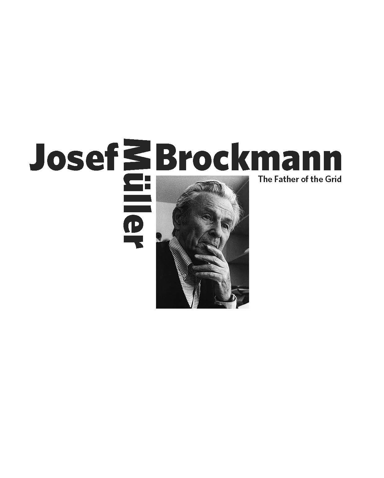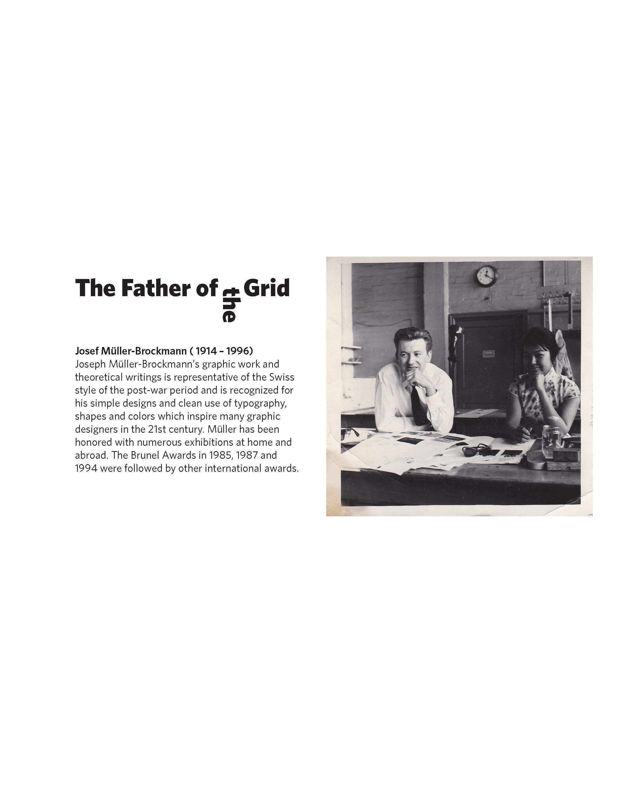
Josef Müller-Brockmann
Layout Design
Typography Design, Auburn University Summer 2022
Decisions Behind The Layout: When making my composition, I wanted to use the same techniques used by Muller-Brockmann in the specific designs I chose. To accomplish this, I went and looked at his Grid System book and found his use of blocky texts and conjunction of pictures. I employed the use of black backgrounds on the sides of the spreads that displayed the grid of images because I felt that the black background solidified the grids and made them easier to see. I also thought that setting the image in a “static” way on the page contrasted with the dynamic style that the photos displayed. I used the same technique in the headlines throughout the spreads as I did the cover headlines –both front and back– because I wanted to keep my spreads consistent with similar elements. The pull quotes that I included in my spreads were framed in a red color that took pieces from the images of Muller-Brockmann. They added a feeling of airiness and removed the tension from such opposite colors as just white and black. I thought they accented each page well and believed that it wouldn’t have given the same effect if I had chosen a different color.